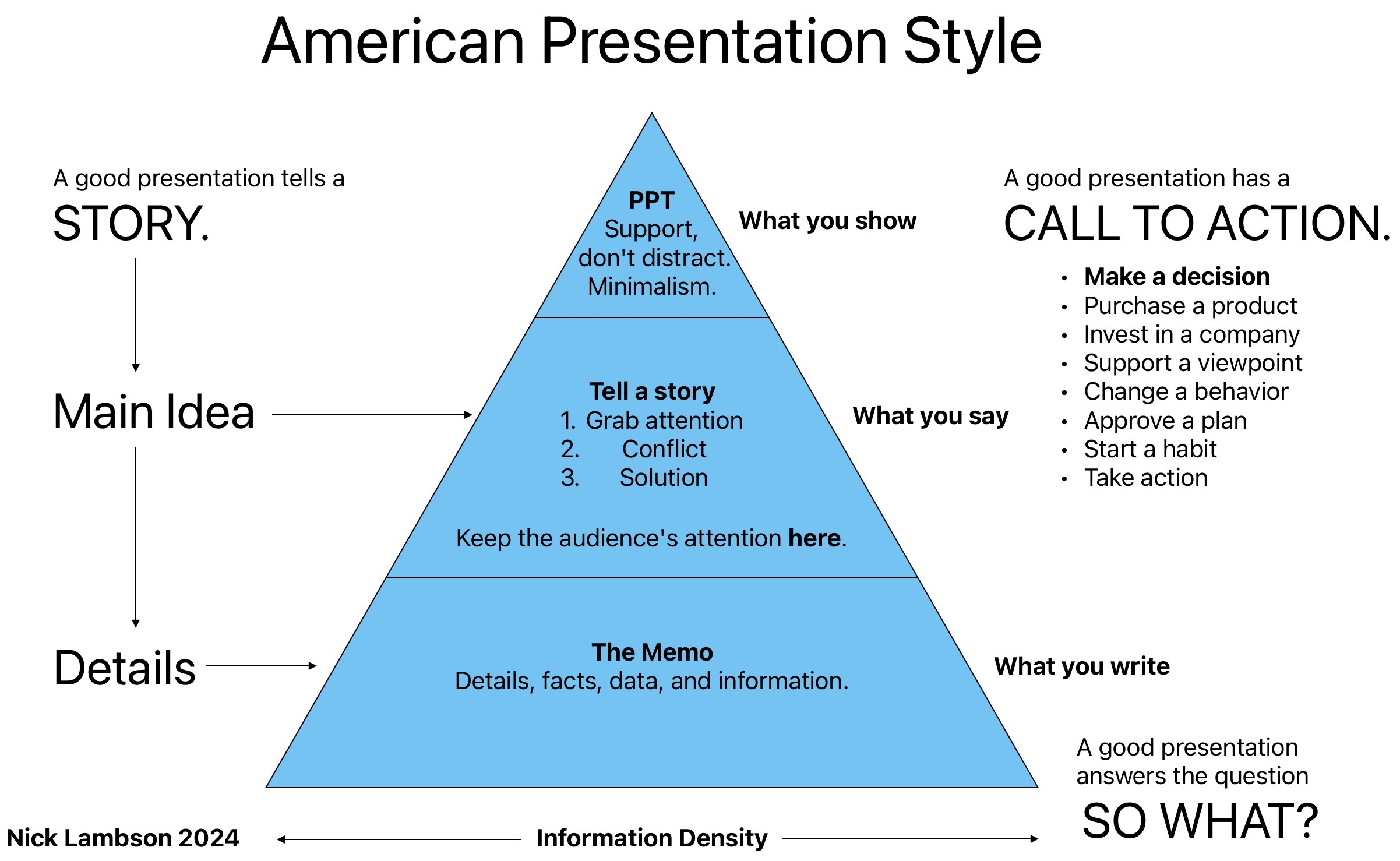
American Presentation Style
Making an Impact
When asked to teach an intercultural communication workshop to the employees of SINOSURE’s international department, I spent remarkably little time discussing language and significantly more time discussing culture and communication style. (SINOSURE is China’s state-owned export and credit insurance bureau, insuring hundreds of billions of dollars worth of Chinese exports abroad every year.) One key aspect of intercultural communication is presenting.
The Purpose of a Meeting
A presentation is usually held as part of a meeting. Meetings are so common and frequent that we may assume that everyone approaches meetings the same way. But you may be surprised to find out that the purpose of a meeting or the purpose of a presentation may vary from culture to culture. What do you think about the views below?
A. In a good meeting, a decision is made. B. In a good meeting, various viewpoints are discussed and debated. C. In a good meeting, a formal stamp is put on a decision that has been made before the meeting.
“The large majority of Americans responding to this question chose option A. The French, however, largely chose option B. And most Chinese and Japanese selected option C. In many Asian cultures, the default purpose of a meeting is to approve a decision that has already been made in informal discussions. Therefore, the most appropriate time to express your disagreement is before the meeting to an individual rather than during the meeting in front of the group.”
— Erin Meyer
The purpose of a meeting in America is to make a decision.
Call to Action
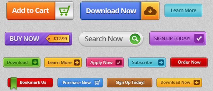
Just like American meetings are designed to result in a decision, American website design is oriented around action. All modern websites have a button known as the “Call to Action” or “CTA.” This button usually says something like “Sign Up” or “Buy Now.” This button is always visible on the website, and all the content on the website is aimed at getting the viewer to click the CTA button. Every presentation should have a call to action. A call to action should be formulated like this: “These people should do this thing at this time.” It’s only one group of people, and it’s only one thing. Be careful about issuing multiple calls to action. Issuing one is more effective. Consider that Nike’s slogan is a call to action: “Just Do It.”
Information Density
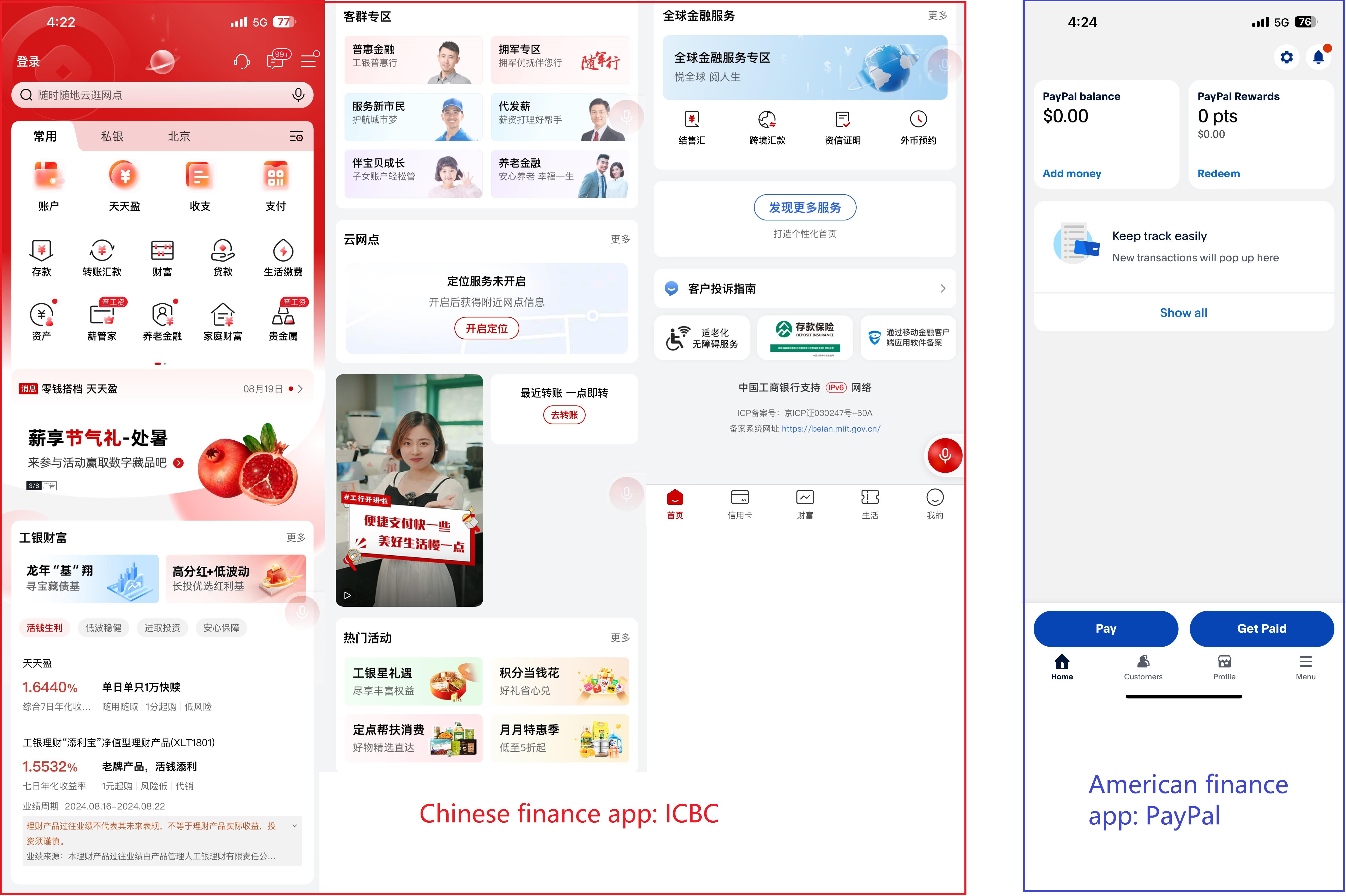
One well-researched field related to slide deck design is user interface design. Chinese user interfaces are information-dense. That means Chinese expect to see all the information available on the screen. This can result in long titles, many buttons, deep menus, and blocks of text. Chinese design efficiently uses screen real estate to pack as much information as possible into a small space. In contrast, Western design emphasizes simplicity, clarity, and focus. Design is simple, there are few visual elements, and there is plenty of whitespace. Western design is minimalist.
The Chinese bank app ICBC presents users with a wide range of buttons, menus, and information. Users of the app get the impression that ICBC is a very capable bank that can service their every need. Chinese users are accustomed to information-dense layouts. They like having all the options available at their fingertips. In contrast, PayPal recognizes that their users just want to do two things: pay and get paid. All the empty space on the screen directs the user’s attention to the bottom of the screen, where two buttons are highlighted: Pay and Get Paid. The app design prompts action from the user. It’s easy to know which button to press. All other features and settings are hidden behind other menus or buttons.
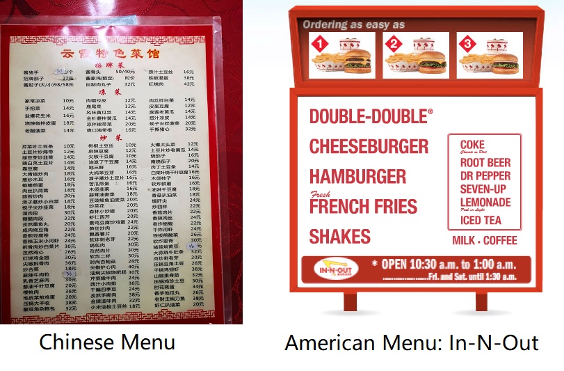
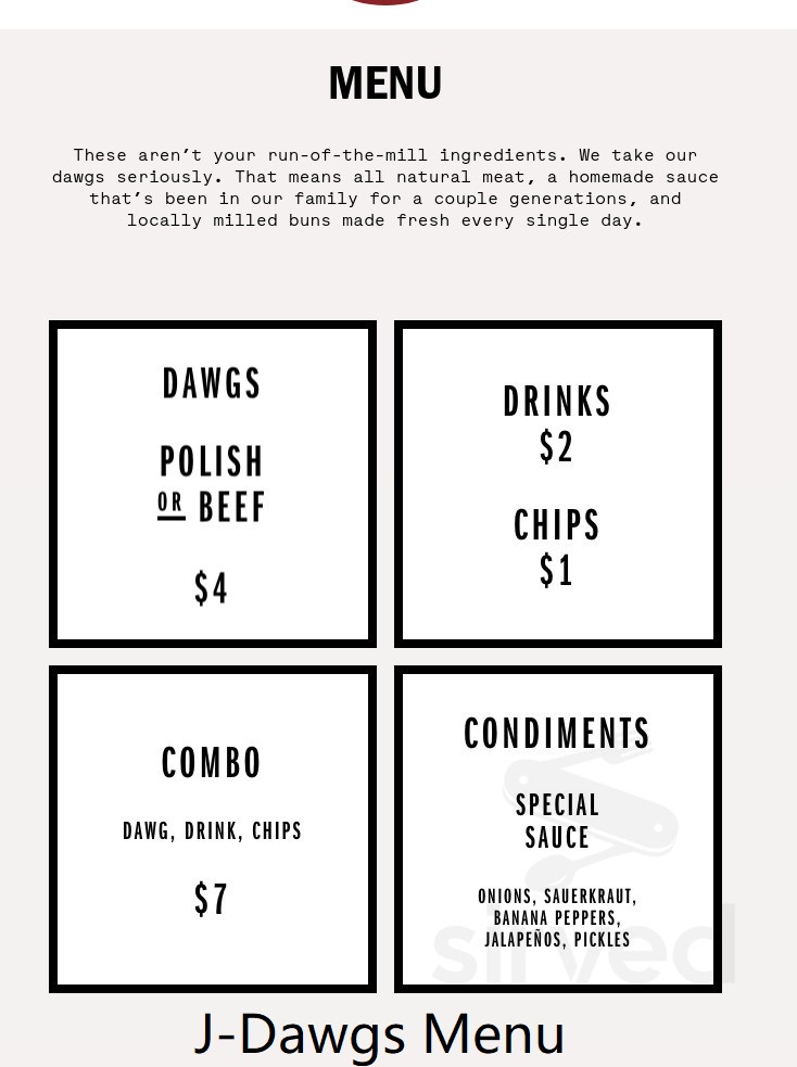
Upon entering a Chinese restaurant, you’ve probably seen a menu like this. You feel an overwhelming sense of abundance and comfort. A great meal awaits you. You feel secure in the hands of the waiters and waitresses, knowing that such a varied and comprehensive menu can satisfy your every desire. The menu reflects the incredible skill of the Chinese chefs: they can make just about anything they can imagine. In contrast, the popular American chain In-N-Out does exactly that: gets customers in and out. Here, the menu prioritizes speed of decision-making above all else. Phrases like “Ordering as easy as 1, 2, 3” reinforce this point. People come to In-N-Out for what they do best: hamburgers. Adding menu items would be a mistake. Another American chain, J-Dawgs, originated in my home state of Utah. They sell hot dogs. The menu is even simpler than In-N-Out’s. It even highlights the company’s commitment to high quality and fresh ingredients.
Tell a Story
The best example of American-style design is Apple. Steve Jobs wasn’t just a high-octane CEO and technologist, he was a master storyteller. When Jobs was fired from Apple in 1985, he built Pixar, an animation company known for its universally-loved stories. In 1994, he explained:
“The most powerful person in the world is the storyteller. The storyteller sets the vision, values, and agenda of an entire generation that is to come… and Disney has a monopoly on the storyteller business. You know what? I am tired of that bullshit, I am going to be the next storyteller.”
— Steve Jobs
A great presentation tells a story, and there are three parts to a great story.
- Grab the audience’s attention
- Introduce a conflict
- Resolve the conflict
The most important indicator of a good story is simply if it’s interesting to listen to. If the presenter grabs the audience’s attention, introduces a conflict, and resolves it, the presentation will be more impactful.
Less is More
In contrast to the Chinese emphasis on high information density, Westerners have a popular phrase: “less is more.” This is the design philosophy of minimalism.
Here are some expressions of this design philosophy. Each slide has a maximum of three items to pay attention to. Slides don’t have much text. Short phrases are preferred over sentences. Numbers are emphasized the most because numbers and facts tell a story and give evidence. Numbers are represented visually in graphs and charts to make a compelling case. Western design uses plenty of whitespace, which directs the viewer’s eye to what is most important.
Save it for the Memo
Many Chinese presenters use the slide deck the same way they would a Word document, cramming in “walls of text” that distract the audience from the speaker. What they don’t realize is that there’s another document that’s intended to deliver textual facts in an organized way: the memo. A memo is a concise document that summarizes key points and provides detailed information in a structured format. It allows the audience to focus on the presentation itself, while having access to all necessary details in a separate, easily digestible form. By using memos effectively, presenters can maintain the audience’s attention and ensure that their message is communicated clearly and efficiently.
Aesthetic Quality
The American eye is highly attuned to subtle details in design. Using an inappropriate font, selecting jarring colors, breaking lines of text at inopportune places, allowing text to protrude off the screen, overlapping separate elements, choosing an irrelevant theme, or requiring the audience to squint at the minuscule text are all big turnoffs. Inexperienced presenters often make these mistakes without knowing they are making them. What’s worse, these mistakes convey two messages that will end a business relationship.
- My messy slides are a reflection of my messy mind. I don’t know what I’m talking about.
- My messy slides are a reflection of my neglect and disregard. You’re not important to me.
Put in plenty of work to make your slides look good, and it will pay off in trust and respect.
One Idea, One Slide
Contrary to popular belief, humans don’t multitask. They just switch between tasks, and with every switch, energy and focus is lost, never to be recovered again. Asking your audience to multitask by displaying multiple ideas on a single slide is a recipe for disaster. First, they will consider it their task to stop listening to what you’re saying and embark on a treasure hunt with their eyes to figure out the connection between everything on the slide. Second, putting multiple things on a slide doesn’t even guarantee that the audience will understand it. More likely, they will become more confused as a result.
So, follow this mantra: one idea, one slide. Forget about slide limits. It’s fine to have 30 or even 50 slides. You don’t need to spend more than 30 seconds on each slide. Modern software like PowerPoint makes the transitions between slides seamless, with the Morph feature. Don’t worry about your slide count. Your audience is not counting, and neither should you.
Show, Don’t Tell
An image is worth a thousand words. And too often, slide designers write a thousand words before they even think about visualizing what they’re talking about! Ideas are most effectively conveyed using simple images, and you should use this to your advantage. Whenever you observe yourself typing bullet points, sentences, or paragraphs of text, stop. Think: “How can I show instead of tell?”
Use each slide as your canvas. Use diagrams intelligently to express your ideas. Does your point convey hierarchical information? Sequential? Relational? There’s a diagram just for you. Venn diagrams, pyramids, swimlanes, flowcharts, organizational charts, mind maps, timelines, and matrix diagrams are all excellent tools to visually communicate your ideas effectively.
Icons are powerful visual tools that can convey complex ideas quickly and efficiently. By using icons, you can encapsulate a significant amount of information in a small, easily recognizable image. They help in breaking down language barriers, as their meanings are often universally understood. Incorporate icons as much as you can.
If you need to describe something more complex, try designing a diagram using Microsoft Visio or Apple’s Freeform. Remember to keep your diagrams simple and focused, avoiding unnecessary details that might overwhelm your audience. Your slides should support, not distract.
30 Point Font
Longtime Apple guru Guy Kawasaki established a rule: Thirty or above. All text on the slide should appear in 30-point font size or above. This font-size requirement serves two purposes. Firstly, it makes your presentation easier to see, especially for people in the back of the room. Second, it puts an artificial limit on how many words you can cram onto the slide. When the minimum font size is 30-point font, you will quickly approach the limits of aesthetic beauty and have to rethink your idea to make it more concise. That’s a good thing.
Three Words Per Slide
Apple’s CEOs Steve Jobs and Tim Cook put remarkably few words on their slides. Tim Cook’s slides from the Apple Silicon announcement featured the words: “Historic Day,” “Apple Silicon,” “Two-Year Transition,” and “First system by end of year.” If three words per slide are enough for Tim Cook, it’s enough for me. This rule is easier to follow if you’re following the other rules: one idea, one slide; show, don’t tell, and 30-point font. Make every word count by limiting to three words per slide.
“I didn’t have time to write you a short letter, so I wrote you a long one.”
— Mark Twain
So What?
Ask yourself this question at the end of your presentation: “So what?” If the answer is not clear, you have failed. “So what?” means “What do I do next?” or “Why is this important?” To ensure this question is easily answerable, be sure to craft your speech as a story, with an attention grabber, a conflict, and a resolution. Express your ideas visually. And most importantly, leave the audience with a call to action. This call to action should be specific and actionable, guiding your audience on the next steps they should take. Whether it’s adopting a new strategy, considering a different perspective, or implementing a particular solution, make sure your audience knows exactly what you want them to do after your presentation. This clarity not only reinforces the importance of your message but also empowers your audience to act on it.